Photo Frame:
Back (card)

I have chosen this texture to be the back board of my photo frame that will hold the image in place, I chose this texture as it is slightly off coloured showing the photo fame maybe a bit older which may also show the sentimental value to the astronaut. This will contribute to the feel of my sequence because it will enable the audience to connect to character on an emotional level as they may be able to relate to them.
https://www.google.co.uk/search?safe=strict&hl=en-GB&q=Paper&tbm=isch&tbs=simg:CAQSkwEJ6k9aKdKuVMAahwELEKjU2AQaAggKDAsQsIynCBpgCl4IAxIm5AIOsAHaB5kSsQHfB9sH4wIC3inlJ-o31yjWKOk34CHrJ9oh1T4aMBOuS1PsYYp1jR7YlFCwKcQf8pxz-lG90wA6YiKdexVHalFPjPQDWIyF2HeRUr9YayAEDAsQjq7-CBoKCggIARIEo3ht-Qw&sa=X&ved=0ahUKEwjSpuSV7MXPAhUIKsAKHX0oBkEQwg4IGygA&biw=1275&bih=955#imgrc=mdljwbAXVcgexM%3A
Front(wood)https://www.google.co.uk/search?safe=strict&hl=en-GB&q=Paper&tbm=isch&tbs=simg:CAQSkwEJ6k9aKdKuVMAahwELEKjU2AQaAggKDAsQsIynCBpgCl4IAxIm5AIOsAHaB5kSsQHfB9sH4wIC3inlJ-o31yjWKOk34CHrJ9oh1T4aMBOuS1PsYYp1jR7YlFCwKcQf8pxz-lG90wA6YiKdexVHalFPjPQDWIyF2HeRUr9YayAEDAsQjq7-CBoKCggIARIEo3ht-Qw&sa=X&ved=0ahUKEwjSpuSV7MXPAhUIKsAKHX0oBkEQwg4IGygA&biw=1275&bih=955#imgrc=mdljwbAXVcgexM%3A

I chose this wooden texture as it looks very homely, this will look out of place in a space ship on purpose to remind the audience that the astronaut is still a person. The image inside my photo frame was one of my own taken when I did a skydive.
https://www.google.co.uk/search?safe=strict&sa=G&hl=en-GB&q=wood+table+texture+seamless&tbm=isch&tbs=simg:CAQSkwEJqwdfOR7VGJwahwELEKjU2AQaBAgCCAUMCxCwjKcIGl4KXAgDEiTRAQ3ZB9AB2gcCjgkvBaAV3inqJ-Un6SfXKOk32iH6Ne017DcaMM8LP9OnrKyJ5cTWZSe_1ioYsp3q8W2TSZMLkmViqS4WmIj29EvamZ5p4emT_1FLbSxCAEDAsQjq7-CBoKCggIARIEFg_1_1zgw&ved=0ahUKEwjIvOyq7cXPAhUHBsAKHRgcCeQQwg4IGygA&biw=1275&bih=955#imgrc=RD4xvZGZOzneIM%3A
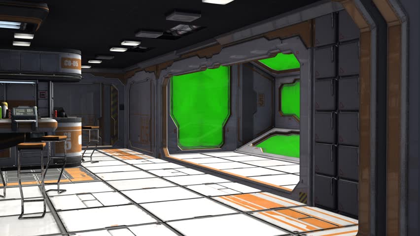
Interior of spaceship
Walls/Background Objects (Blue)


I chose both the blue and gold textures as they are very luxurious colours that would make the intertior look very classy. I chose these as they they would make the spaceship look like it belonged to the astronaut showing in the future what money could buy. As my target audience in teenagers I feel these colours would appeal to them as they are a combination of bright and dark colours yet still looking effective.
https://www.google.co.uk/search?safe=strict&hl=en-GB&q=gold+metal+texture+seamless&tbm=isch&tbs=simg:CAQSkwEJ_1ZsJ1hXzSYkahwELEKjU2AQaAggLDAsQsIynCBpgCl4IAxIm2gfVAwL9Ao4JlgmXCZAJBdEB1yjaIdYo3inlJ-AhnTfrJ4gn6jcaMJriAdN0dw2F7iANPFe8LaRbRK3JQmnfGarl-SvYo6eGaKF6uoQ20Z6AFQlIUTcgEyAEDAsQjq7-CBoKCggIARIEXMr8Yww&sa=X&ved=0ahUKEwjwkJiQ78XPAhVFOMAKHZs1ARAQwg4IGygA&biw=1275&bih=955#imgrc=xS-s8V8IG_IsJM%3A
Carpet

I chose this carpet texture to put in the spaceship following the luxury theme, it shows how even in a spaceship there is comfort. This would appeal to my target audience as it is a "home comfort" as this is an everyday item you would see in most houses meaning there is something relatable or recognisable in the spaceship.
https://www.google.co.uk/search?safe=strict&sa=G&hl=en-GB&q=carpet+floor+texture+seamless&tbm=isch&imgil=tR-C1mfFUzUCOM%253A%253BqMQul9HdTAUaiM%253Bhttp%25253A%25252F%25252Fcarpet.vidalondon.net%25252Fcarpet-texture-png%25252F&source=iu&pf=m&tbs=simg:CAES7gEJgnJ8dHrxt84a4gELEKjU2AQaAggDDAsQsIynCBpgCl4IAxIm0gcHyRXUC8gVgB7RB8cVAtQe6TffKe014CGiKN4p6jfsN_1U3pigaMC6pmzWiNd2ZjSbA5fiXaZGL3EFXroDoiELg_1Bs54ijDLZ3MgvYpGBAFFS211SCm7yAEDAsQjq7-CBoKCggIARIEWiS53QwLEJ3twQkaUgobCgd0ZXh0dXJl2qWI9gMMCgovbS8wNTIxZGJoChkKB3BhdHRlcm7apYj2AwoKCC9tLzBod2t5ChgKBWdyYXNz2qWI9gMLCgkvbS8wOHQ5Y18M&fir=tR-C1mfFUzUCOM%253A%252CqMQul9HdTAUaiM%252C_&usg=__qf08cZkA2IKFoCZbX-7jM2WKoFk%3D&biw=1275&bih=955&ved=0ahUKEwjv25bg7cXPAhXpBsAKHVtZBtEQyjcIRA&ei=SBj2V--XFOmNgAbbspmIDQ#imgrc=gnJ8dHrxt84yOM%3A
Coffee Cup
Cardboard Outside

Much like the carpet this is a every day item you would see, I put it in my spaceship as again it would be a recognisable object to the target audience helping them believe the idea of space is not just a dream creating wonder and hope. I also used this texture to enhance the look of my coffee cup and make it look more realistic.
https://www.google.co.uk/search?q=wood&safe=strict&hl=en-GB&biw=1275&bih=955&source=lnms&tbm=isch&sa=X&ved=0ahUKEwjnjvuT7sXPAhWsL8AKHWuqCscQ_AUICCgB#safe=strict&hl=en-GB&tbm=isch&q=corrugated+card+texture&imgrc=0hYbapPm3siFUM%3A
White Card inside

This will be the rim of my coffee cup adding extra detail the player may not even notice to enhance the look of my coffee cup and make it look more real.
https://www.google.co.uk/search?safe=strict&sa=G&hl=en-GB&q=texture&tbm=isch&imgil=Qq_s7-y9r6PsXM%253A%253BE6zssk23segCQM%253Bhttp%25253A%25252F%25252Fwww.graphicsfuel.com%25252F2012%25252F10%25252Flight-subtle-grunge-textures-pack%25252F&source=iu&pf=m&tbs=simg:CAESpwIJZYoB7wY4LyUamwILEKjU2AQaAggKDAsQsIynCBpgCl4IAxImsAGxAbUBpAe0ARDuAg7tAvIS1ijlJ-sn6jfXKIgnrDbgIdoo2CgaMPjJPJEOWD4HqugkuFyp2k-qU8HVBaaBWQ9momhZ1loV15LCp6EBbdjo7ALga75wGSAEDAsQjq7-CBoKCggIARIEIrt-lwwLEJ3twQkaigEKGwoHdGV4dHVyZdqliPYDDAoKL20vMDUyMWRiaAobCghtYXRlcmlhbNqliPYDCwoJL20vMDFsMHkwCh0KCm1vbm9jaHJvbWXapYj2AwsKCS9tLzAxbXdrZgoXCgVwYXBlctqliPYDCgoIL20vMDY0MWsKFgoDc2t52qWI9gMLCgkvbS8wMWJxdnAM&fir=Qq_s7-y9r6PsXM%253A%252CE6zssk23segCQM%252C_&usg=__1pVX5XaBk_bQI6ToDrcZw6zb3dM%3D&biw=1275&bih=955&ved=0ahUKEwjRsty57sXPAhWIAcAKHXxKCRQQyjcIQQ&ei=BBn2V9GgB4iDgAb8lKWgAQ#imgrc=LRHTnR8doGRA9M%3A
Lego Figure
Face

This is the face of my lego figure, I will use this to texture the polygon that is the Lego figures head. This will make it again look very realistic however in particular I chose a smirking face as I feel this will appeal to my target aguience, It looks as if the figure is saying "look I'm in space" with facial expressions which I feel will appeal to the teenagers sense of humor.
https://www.google.co.uk/search?safe=strict&sa=G&hl=en-GB&q=lego+faces+clip+art&tbm=isch&tbs=simg:CAQSlAEJ6IzmcvnG0cYaiAELEKjU2AQaAggLDAsQsIynCBphCl8IAxInhgmFCYcJgwmiFJQIggnGFIEJR_14zpSOkI4YtlTWfNPwrpi2mPegtGjCLKJgg5Meun0tQg4UJADr4CiTl1nrGi4i_1r_1ZREkdbQKwzW212NTyRefeD3LCuGNkgBAwLEI6u_1ggaCgoICAESBEl5JkYM&ved=0ahUKEwiRv-eo78XPAhVlIcAKHfjwAMkQwg4IGygA&biw=1275&bih=955#imgrc=BnVRmQiMS8oVqM%3A
Body

This texture will be featured on my lego figures body, this is so my animated figure looks as close to a real one as possible. Again I feel if the audience can see objects that they recognise they will feel more relaxed and the idea of space will become more real.
https://www.google.co.uk/search?safe=strict&sa=G&hl=en-GB&q=lego+super+heroes+the+shield+helicarrier+building+set+76042&tbm=isch&tbs=simg:CAQSlQEJXAeyHfeU6p4aiQELEKjU2AQaAggIDAsQsIynCBpiCmAIAxIo_1gj_1CLQChAr3A-AB-Ai2ArICgwqiPeA8rz28M5o0rD3fPKk9uz_1CPRowoKNrxeIf_1Hs2pSFFRHEgYGuc9rHVI2gfOHt_1yKIL9myVwzxkvzstd3u2QyfYARk9IAQMCxCOrv4IGgoKCAgBEgQr_12seDA&ved=0ahUKEwiT6dnd78XPAhWBL8AKHTDHAyYQwg4IGygA&biw=1275&bih=955#imgrc=7stAx0i9JvLBQM%3A
Spray Paint Can
Label

This is the texture I will be using for a spraypaint can, it currently looks like an unravled lable, as there is more to the spraypaint can I will be using the white texture underneath, this is becuse I feel white will pop out against my background where as black would just blend in, I want each individual asset to be noticed by the player all for different reasons weather it be an intresting shape, a recognisable object or bright colours etc.
https://www.google.co.uk/search?safe=strict&sa=G&hl=en-GB&q=spray+paint+label&tbm=isch&imgil=A4DnitUBR693pM%253A%253B9lOMjd4g4npHhM%253Bhttps%25253A%25252F%25252Fwww.pinterest.com%25252Fthaisfernanda56%25252Fdollhosetintas%25252F&source=iu&pf=m&tbs=simg:CAESuQEJI26iPlFya3EarQELEKjU2AQaAggDDAsQsIynCBpiCmAIAxIonxOiE_18HoxOcE-8HnhOCCJkToBPYPdc93jTVPdo91j2MN7gokzfTPRowGh3KOB0IegigNOwnLBaxXDFZDGwHo7YLXJTFw0mSKvNwicZ63ah7Ir-Vwll-vHjTIAQMCxCOrv4IGgoKCAgBEgRwjmMJDAsQne3BCRobChkKBW1lZGlh2qWI9gMMCgovbS8wM3FoMDNnDA&fir=A4DnitUBR693pM%253A%252C9lOMjd4g4npHhM%252C_&usg=__Yiu7W_JR5E49S7QlCUIWf5g5bm8%3D&biw=1275&bih=955&ved=0ahUKEwiMk5yF8MXPAhVqJsAKHQ9ODfgQyjcINA&ei=rhr2V4yENurMgAaPnLXADw#imgrc=A4DnitUBR693pM%3A
Colour

https://www.google.co.uk/search?safe=strict&sa=G&hl=en-GB&q=king+power+logo+png+white&tbm=isch&tbs=simg:CAQSlQEJmm5azY8jvKQaiQELEKjU2AQaAggKDAsQsIynCBpiCmAIAxIopAejB7UBsAHuEvAS8hKlB-gF8xKIJ58j1iisNug2hCOlNMYh0yeeNxowiz3SSVPTzlOnOLVum3pBQmrw42GQ5IbXA95e23yEWS-FwzKNP8ZKOMntwo4gsNA5IAQMCxCOrv4IGgoKCAgBEgTPV4-UDA&ved=0ahUKEwje3que8MXPAhVHAcAKHQl9DicQwg4IGygA&biw=1275&bih=955#imgrc=k9K9KNFc-9MFdM%3A